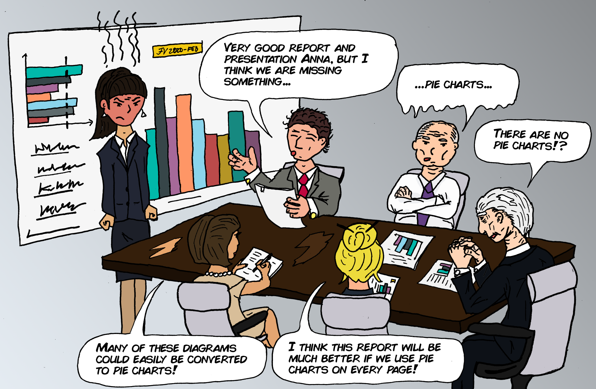
The Overuse of Pie Charts – the Abuse of Data Visualization
With self-service BI-tools like Power BI, Tableau and Qlik, it has never been easier to visualize data. Now when every office clerk can make astonishing beautiful dashboards, there is one thing I rather not see on those visualizations…pie charts.
If you don’t understand why, I recommend you to read “Save the Pies for Dessert” by Stephen Few. It’s an old article but highly relevant, especially now when so many without training in data visualization are making dashboards that influence countless business decisions every day.
And if you really, really need to make a pie chart (I admit, there are some limited use cases for them) please at least make it a donut chart.
